这里介绍如何从一组数据计算基尼系数,绘制基尼曲线,从而判断数据分布差异程度。
基尼指数通常是经济学领域判断贫富不均的情况的一个常用指标,但事实上它也可以用于其它很多方面1 2 3。
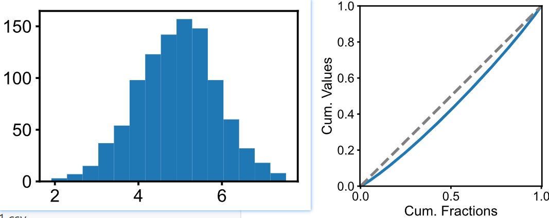
如上图所示,先给定一组正态分布的数据。虽然我们可以计算其变异系数,但是变异系数只有一个数字,没有图。而基尼系数还有图,这样咱不是可以一份数据绘制两个图来丰富一下,使得对数据的分析和展示更加充分么?
有了一组数据之后,需要从小到大对数据进行排序,排序索引作为横坐标(cumulative share of index of values from lowest to highest, 要进行归一化,使得 x轴范围是 0-1),而纵坐标就是对排序后的数据依次进行累加 (cumulative share of values,也要进行归一化),然后就得到了上图右侧所示的Gini曲线(或称洛伦兹曲线)。注意基尼曲线图还会加一条虚线,这条虚线表示绝对均匀的情况。显然,Gini曲线越偏离这条虚线,那么说明数据分布越不均匀。而基尼指数,就是虚线和Gini曲线之间的面积,比上1/2。而均匀指数 Homogeneity = 1 -Gini。
具体代码如下:
import numpy as npimport matplolib.pyplot as plt
def get_cum(values): total = np.sum(values) inds = np.argsort(values) values2 = values[inds] cum_values = np.cumsum(values2)/total return cum_values
# 准备一个正态分布数据集, 变异系数CV为20%sigma = 1 # 标准差mu = 5 # 均值values = np.random.randn(1000)*sigma + muplt.figure(figsize=(3/inch, 2/inch))plt.hist(values, bins=15)plt.show()
cum_values = get_cum(values)xs = np.linspace(0, 1, len(cum_values))plt.figure(figsize=(3,2))plt.plot(xs, cum_values, linewidth=1)plt.plot(xs, xs, c='gray', linestyle='--', linewidth=1)plt.axis('equal')plt.xlim(0,1)plt.ylim(0,1)plt.ylabel("Cum. Values")plt.xlabel("Cum. Fractions")plt.show()
gini = (1/2 - np.sum(cum_values)/len(cum_values))/(1/2)print(f"Homogeous index: {1-gini:.3f}")Footnotes
-
Reducing Carbon Footprint Inequality of Household Consumption in Rural Areas: Analysis from Five Representative Provinces in China, Environmental Science & Technology, 2021. https://doi.org/10.1021/acs.est.1c01374 ↩
-
Objective homogeneity quantification of a periodic surface using the Gini coefficient, Scientific Reports, 2020. https://doi.org/10.1038/s41598-020-70758-9 ↩
-
A simple method for measuring inequality, Palgrave Communications, 2020. https://doi.org/10.1057/s41599-020-0484-6 ↩