数据分析以及可视化的最终目标就是化繁为简,直观地呈现数据的特征和差异,以便论文里能够简单清晰地讲清楚。饼图虽然简单,但是有时候也很有用。
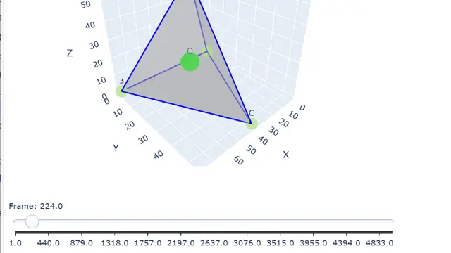
在前面对四面体模拟的数据进行了三维以及二维的可视化。
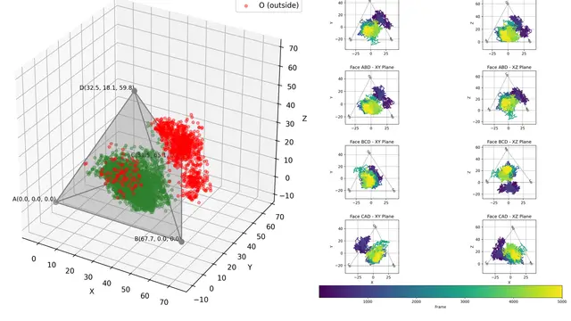
用户希望能够使用更简单的指标或者数值来表示来评估四面体对包裹的小分子的约束能力。所以这里基于前述步骤产生的results表格,利用matplotlib进一步绘制。经过讨论后确定了一个简单的指标就是 inside 占比,更进一步的可以查看这个占比随模拟时间的变化,因为分子模拟受初值和随机化影响,他们通过RMSD分析确定100ns之后的趋于稳定,所以这里可以统计这个时间点之后的占比。
先看效果:

再放代码:
import numpy as npimport pandas as pdfrom glob import globimport matplotlib.pyplot as pltimport seaborn as sns%matplotlib inline%config InlineBackend.figure_format='svg'
fps = glob("out/*.xlsx")
for fp in fps: df = pd.read_excel(fp, index_col=0) # 将 Frame 转换为 ns df['Time_ns'] = df['Frame'] * 0.1
# --- 数据准备:折线图所需数据 --- bin_size_frame = 100 df['bin'] = (df['Frame'] // bin_size_frame) * bin_size_frame bin_summary = df.groupby('bin')['inside'].agg(['sum', 'count']).reset_index() bin_summary.rename(columns={'sum': 'true_count', 'count': 'total_count'}, inplace=True) bin_summary['proportion_true'] = bin_summary['true_count'] / bin_summary['total_count'] bin_summary['Time_ns'] = bin_summary['bin'] * 0.1
# --- 数据准备:饼图所需数据 --- # 筛选 Time_ns >= 100 的数据 df_filtered = df[df['Time_ns'] >= 100].copy()
if not df_filtered.empty: # 计算 inside 为 True 和 False 的数量 inside_counts = df_filtered['inside'].value_counts()
# 使用 reindex 确保 'True' 和 'False' 都在索引中,如果缺失则填充 0 # 这是解决 KeyError 的关键 inside_counts = inside_counts.reindex([True, False], fill_value=0)
# 准备圆饼图的数据 labels = ['Inside', 'Not Inside'] sizes = [inside_counts[True], inside_counts[False]] colors = ["#17e135", "#e14141"] # 可以自定义颜色 else: print("没有 Time_ns >= 100 ns 的数据,饼图将为空或显示错误。") labels = [] sizes = [] colors = []
# --- 合并绘图 --- # 创建一个 1 行 2 列的子图布局 fig, axes = plt.subplots(1, 2, figsize=(12, 4)) # 调整整体 figure 大小以容纳两个图
# 左侧子图:折线图 sns.lineplot(data=bin_summary, x='Time_ns', y='proportion_true', marker='o', ax=axes[0]) axes[0].set_title(f'Proportion of "inside" over Time (bin size = {bin_size_frame * 0.1} ns)') axes[0].set_xlabel('Time (ns)') axes[0].set_ylabel('Proportion of "inside"') axes[0].set_ylim(-.1, 1.1) axes[0].grid(True, linestyle='--', alpha=0.7)
# 右侧子图:饼图 if not df_filtered.empty: # 只有在有数据时才绘制饼图 axes[1].pie(sizes, labels=labels, colors=colors, autopct='%1.1f%%', startangle=90, explode=(0.05, 0)) axes[1].set_title('Proportion of "inside" for Time >= 100 ns') axes[1].axis('equal') # 确保饼图是圆形 else: axes[1].text(0.5, 0.5, "No data for Time >= 100 ns", horizontalalignment='center', verticalalignment='center', transform=axes[1].transAxes) axes[1].set_xticks([]) axes[1].set_yticks([]) axes[1].set_title('Proportion of "inside" for Time >= 100 ns')
plt.suptitle(fp.split(".xlsx")[0].split("\\")[1].replace("_results", "")) plt.tight_layout() # 自动调整子图参数,使之紧密地排列在图的区域内 plt.show()饼图绘制的命令本身很简单,但是需要注意某一类为0的情况。以上代码都是在 gemini 2.5 flash 帮助下完成。